Cherry Republic Rebrand
WHEN
Spring 2024
ROLE
Graphic Designer
TOOLS
Illustrator
Photoshop
TEAM
Delilah Coe
Background
For my Branding and Identity class that I took while I was studying abroad at Paris College of Art, I was tasked with creating a new logo and rebranding three of their existing products. I chose Cherry Republic as my brand as I have always been drawn to the brand and thought it had potential for more than its original branding.
Process
Research
Strategy
Color Palate & Typeface
Updated Logo & Merchandise
Research
To start this rebrand I researched the history of Cherry Republic to gain knowledge and empathize with their customers and values.
Cherry Republic was founded in Glen Arbor Michigan in 1989, with a total of only six locations, all within the state of Michigan. They sell a variety of souvenir-type products (t-shirts, mugs, tote bags, etc.), marketing themselves to a small crowd the tourists of Northern Michigan. The last brand update was in 2014.
Strategy
My main goal for this rebrand was to expand past just locals and routine northern Michigan tourists. I wanted to focus on changing its branding and identity to be more modern to market to a larger crowd rather than just Michigan tourists.
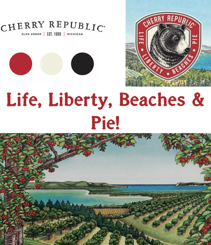
To do this I wanted to keep the same nostalgic feeling while also marketing it as a more luxurious and aesthetic brand appealing to a larger crowd. I made the Mood Board Below to reflect that aesthetic.
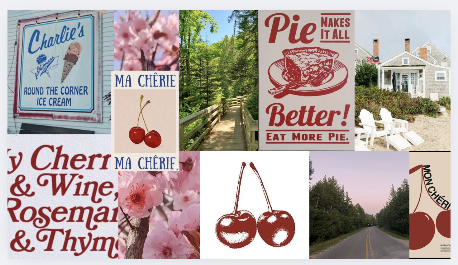
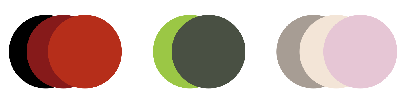
I chose to keep some original brand colors like dark reds and greens, while also bringing in some lighter pinks and beiges inspired by cherry blossoms.
Color Palate & Typeface
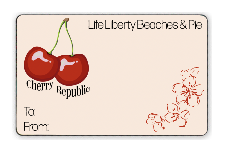
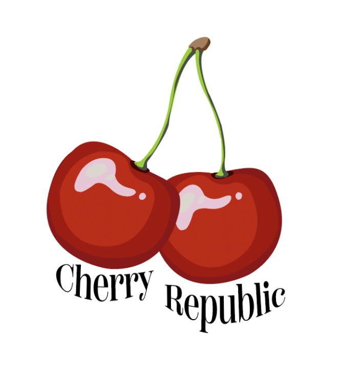
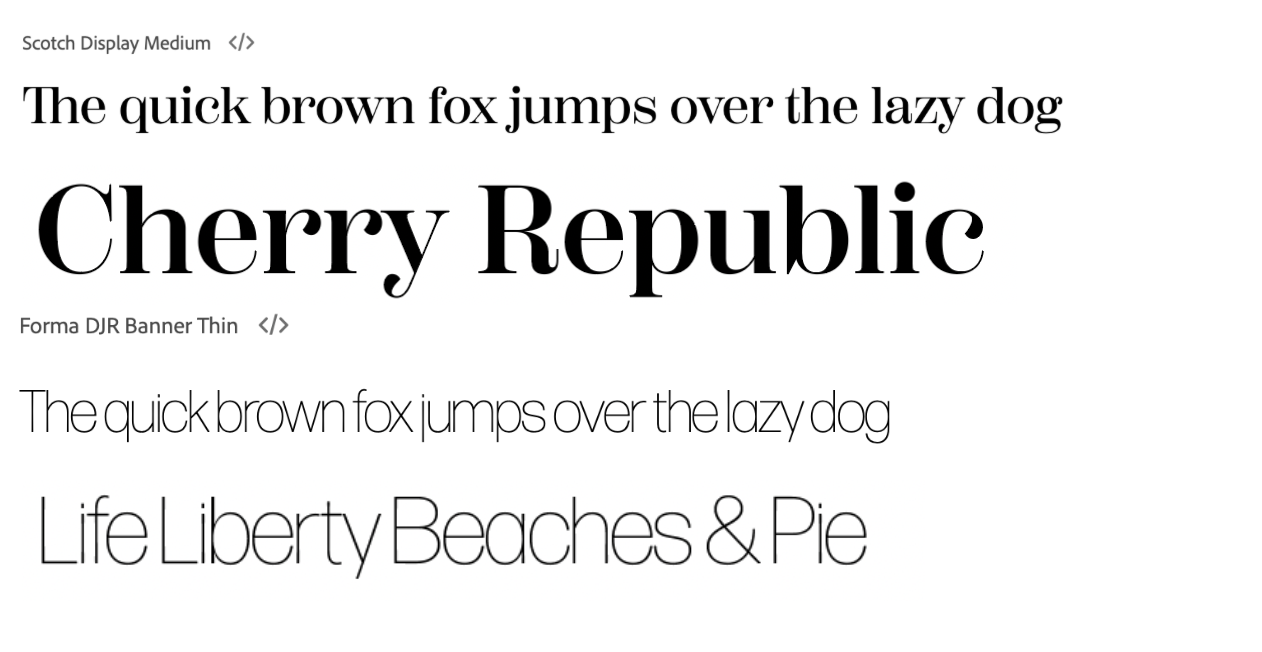
I chose a serif and sans serif typeface. The serif for the “Cherry Republic” Branding and the sans serif for their slogan “Life Liberty Beaches, & Pie”.
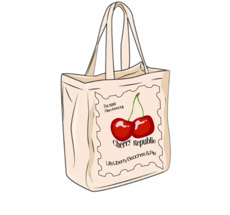
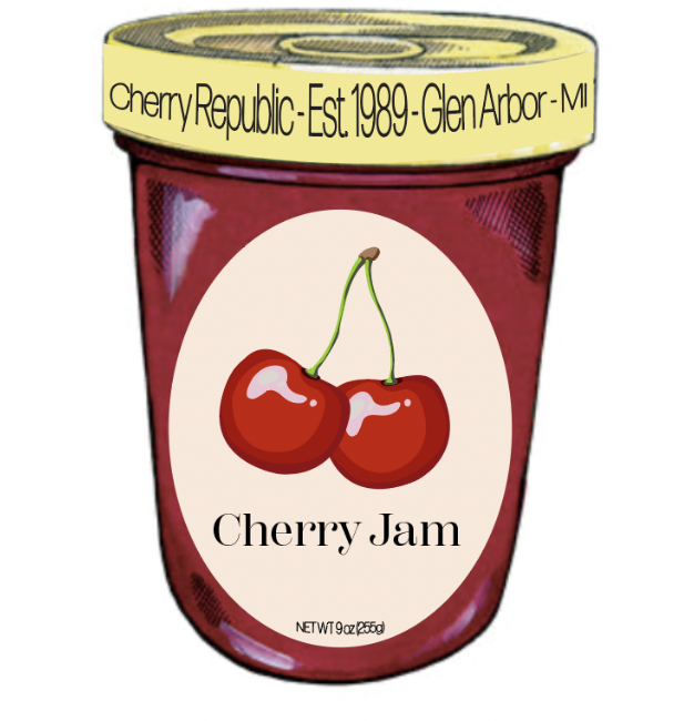
Updated Logo & Merchandise